|
|||
|
|||
|
|||
|
||||||||||||||||||
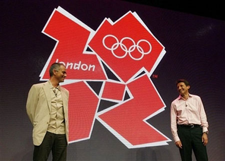
Jagged London Olympics logo leaves critics cold(Reuters)Updated: 2007-06-05 10:19
Design critics described the jagged logo unveiled on Monday for London's 2012 Olympic Games as messy and dated with the most charitable saying it was brave but poorly executed. The logo, four jigsaw-like pieces forming the numbers 2012 and coming in a range of colours from hot pink to electric blue, was saluted as innovative by Jacques Rogge, president of the International Olympic Committee.
Design and advertising professionals were less enthused. "The predominant emotional feel is more about a sense of disintegration. What I almost see is a map of London divided into boroughs," said Chris Bullar, who teaches creative advertising at the London College of Communication. "The 2012 is difficult at first sight to pick out." Patrick Burgoyne, editor of Creative Review, a leading visual communication magazine, said people with whom he had spoken about the logo were "quite shocked and quite outraged". Burgoyne said it was not likely to stand the test of time such as logos for past Games, such as Munich 1972, but he still found some positive elements in the design. "It doesn't have Big Ben or a Union Jack or a crown on it, so the designers should be at least applauded for not going down the wearily predictable route," he said. He also said the logo was well suited for the multi-media age, lending itself to animation and on-line display. On newstoday.com, a popular on-line forum for designers, contributors registered their disappointment. "I like the idea, but don't know if it's been executed as well as it could have been," said one person using the screen name, Raniator. Another user, Moth, replied: "Perfectly reflective of the London Olympics then." More than 80 percent of the respondents to a BBC online poll on Monday disapproved of the logo.
|